Wireframe? Resolution? User-interface?
If you’re working with a web designer, it can seem like there is an overwhelming number of website design terms and jargons you need to know. Being able to speak the language of web design can help you communicate effectively, ask better questions and achieve the website of your dreams.
In this article, we cover 25 important website design terms so you can understand what your web designer is talking about!
1. Above the Fold
One of the website design terms adapted from newspapers — above the fold is a term used to describe the elements on a webpage or website that loads before the user has to scroll down.
Above the fold design and content is crucial as you only have one chance to create a good first impression. It has to not only capture the attention of a first-time user but also convey all your important information in a small area.
2. Accessibility
Accessibility is one of the most important website design terms today as we move towards a more inclusive society. It refers to how accessible your website is for people with hearing or visibility disabilities.
This can include simple copy, larger fonts and icons, a colour-blind friendly colour scheme, as well as proper screen-reader descriptions and alt text for links and images respectively.
3. Breadcrumb
A breadcrumb is a secondary navigation aid that helps users understand where they are in the hierarchy of your website. For example, a typical breadcrumb for a clothing store will be Homepage > Products > Shirts.
4. Call-to-Action (CTA)
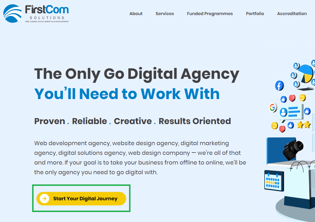
Example of a CTA on a webpage.
Call-to-Action (CTA) as a website design term describes the visual element persuading users to take a specific action. CTAs are used for website conversion goals such as getting customers to sign up, complete a form or subscribe to a newsletter.
When it comes to website design, CTAs are typically distinct and stand out from the rest of the website. This can be done by changing the CTA button to a contrasting colour, using typography to make the text stand out, or a combination of both.
5. Compression
Compression is a website design term with regard to file sizes. Compression is the act of reducing file sizes by eliminating excess data without sacrificing quality.
For websites, it is particularly important for elements such as images to be as compressed to be as small as possible without losing clarity or fidelity. This is because large file sizes can cause a webpage to load slower.
6. Favicon
As far as website design terms go, favicons are like the cherry on top of a delicious cake. Favicons are the tiny 16 x 16 icons that are displayed in the tab bar of a browser. They can be saved as a .cio, .gif or .png image. While Favicons might not be the most crucial part of any website, they are a part of the small details that make your website feel more professional.
7. Focal Point
Perhaps one of the most straightforward website design terms on this list — the focal point is the part of your webpage that you want to draw your user’s eye towards. You’ll typically place important information you want your audience to pay attention to here, such as your best selling point or most effective call-to-action.
8. Footer
Footers are a website design term for the bottom bar of a website. Typically, the footer design stays consistent on every page.
However, the content on the footer can vary from website to website. Some websites choose to simply display copyright information, while others use the space to provide individual links to each website page and social media.
9. Hamburger Icon
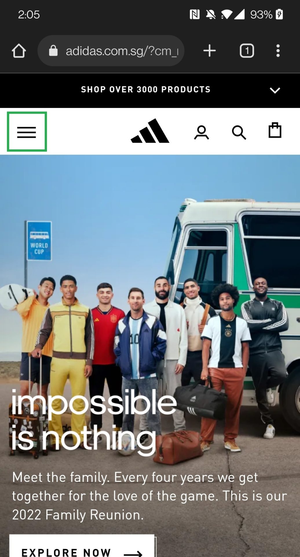
Example of hamburger icon on a mobile webpage.
Why would a specific icon deserve a mention in a list of website design terms? The hamburger icon is a recent and popular addition to many modern websites going for an uncluttered, clean, minimalistic look.
Instead of a traditional navigation bar, these websites are opting to hide the navigation buttons behind an icon made out of three horizontal bars that resemble a hamburger.
10. Hero Image/Text
One of the most commonly used website design terms is hero image or hero text. This refers to the main image and copy on a homepage or landing page. The hero image and text are typically designed to be prominent, attention-grabbing and encourage a call-to-action.
11. HEX Code
A key website design term anyone should be familiar with is the Hexadecimal code or HEX code for short.
The HEX code is a six-digit number preceded by a # that is used to represent colour in HTML and CSS (the main website development languages). It is how designers ensure your colours stay consistent across pages and specifies to developers which colour to code.
12. Joint Photographic Experts Group (JPEG)
Joint Photographic Experts Group (JPEG) is a raster image file type typically used to store digital photos. Most modern cameras will shoot and store images as JPEGs by default.
JPEG uses a lossy compression process to reduce image file sizes and make them easier to store and load on webpages. While this means that images are faster to load as a result, image quality can be somewhat compromised as some data is permanently deleted during the compression process. Zooming in on a JPEG also causes it to become blurry as the pixels get stretched out.
13. Kerning and Tracking
Kerning and tracking are typography jargons that are also commonly found in website design terms.
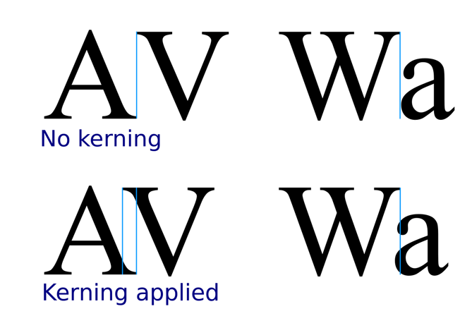
Credit: Sherbyte
Kerning refers to the space between individual letters or characters in a font.
Credit: Fabrikbrands
Tracking refers to the spacing between groups of letters or blocks of text.
14. Navigation
Navigation is a catch-all website design term for your website’s navigation features. It can be further separated into primary and secondary navigation.
Primary navigation refers to the main user interface elements a visitor will use to get around on your website. This includes content like the About page, Product page, Service page, Contact page and more. Primary navigation sections are often displayed prominently to ensure users can quickly find what they are looking for.
Secondary navigation links to content that is less important than primary navigation, but should still be easily accessible throughout the website. Content for secondary navigation are things like carts, search bars or account setting buttons.
Additionally, there are also many ways for navigation on websites to be displayed. Such as navigation bars, dropdown menus, hamburger icons and vertical sidebars.
15. Negative Space / White Space

Negative space or white space refers to the empty space surrounding an element of a webpage such as a product, an image or an icon.
It is designed to draw the viewer’s eye towards the visual element by giving it a good amount of “breathing room”.
16. Open Type Fonts
Fonts on our computer come in two types: Open Type Fonts (OTF) and True Type Fonts (TTF).
While the differences might not affect a layperson, the type of font can have a significant impact on a website designer’s work. OTF fonts allow a designer to add embellishments like ligatures and glyphs to the font characters, while TTF does not.
The OTF format is considered the modern industry standard. They are compatible with Windows and Mac which means they can be viewed and edited with no issues on either platform.
17. Portable Network Graphics (PNG)
Portable Network Graphics (PNG) is a raster image file type commonly used when the image is largely uniform in colour or has a transparent background. PNGs are lossless — meaning no data is lost when the image is compressed and when you edit or save the file. The tradeoff is that PNG images often have bigger file sizes compared to lossy formats, which can affect image loading speed.
PNG image files are typically used for web graphics, logos, charts and illustrations, or when the image requires a transparent background.
18. Resolution
Resolution is a website design term you’ll often hear used when referring to images. Put simply, resolution refers to the amount of detail an image holds. High-resolution images appear sharper, clearer and more detailed while low-resolution images have fewer pixels and can appear blurry when the image is stretched out.
Image resolution is typically expressed as width and height (e.g. 1920 x 1080) or pixels per inch (PPI). The standard resolution for web images is 72 PPI.
19. Responsive / Mobile-friendly
You’ve probably already heard of responsive design. It’s one of the most used website design terms and buzzwords of the decade. With over 90% of Singapore’s 5.45 million internet users browsing the internet on their smartphones, there’s good reason to ensure your website will display well on the thousands of different mobile devices out there.
Responsive and mobile-friendly design are website design terms that are often used interchangeably. Put simply, they are the terms used to describe a website capable of adapting to any device or screen to ensure proper viewing experience and functionality.
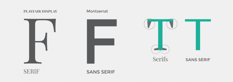
20. Serifs and Sans Serifs
Serifs and sans serifs are technically two website design terms, but you’ll often see them used in the same context. They are categories of fonts and represent the presence (Serif) or absence (Sans Serif) of serifs within the letters.
Credit: Easil
Serifs are small decorative lines or strokes added to the beginning or end of a letter’s stem.
Serif fonts date back to the 18th century when they were commonly used in books, newspapers and magazines. Giving it a more classical, formal and sophisticated vibe.
Popular examples of serif fonts include Times New Roman, Garamond and Baskerville.
Sans serif fonts are seen as more modern, and minimalistic. Their simplicity creates a more approachable feel.
Popular examples of sans serif fonts include Arial, Helvetica and Calibri.
21. Sidebar
Sidebar is a website design term for a column placed on either side of a webpage’s primary content area. This column can be used to display additional information that a viewer might find useful to have easily accessible.
Typically a sidebar may include things like navigational links to other pages, social media links, related posts or even ads for other products and services.
22. Style Guide
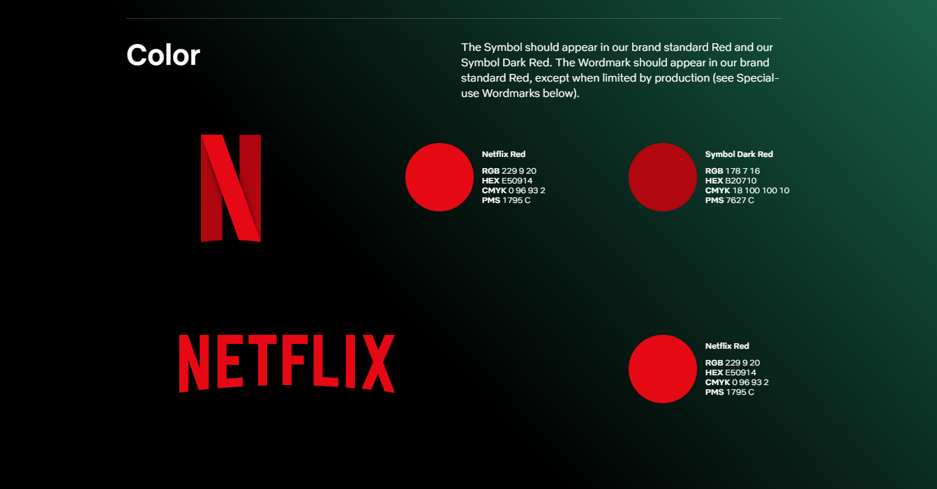
Credit: Netflix
If your web designer asks if you have a style guide — he/she is not talking about your fashion sense.
A style guide is a set of rules governing the use of colours, shapes and fonts to help keep your branding consistent across all pages. This is one of the first website design terms your web designer will bring up as they’ll need to know if your brand has official colours or themes they need to plan around.
23. User Interface (UI) / User Research (UX)
User Interface (UI) and User Research (UX) are two website design terms that are often used together. They may sometimes be used interchangeably even though they are fundamentally different website design terms that work together to improve the user experience on a website.
UI focuses on how a website’s visual and interactive elements affect its overall looks and functionality. This includes experimenting with elements like buttons, icons and typography.
UX on the other hand focuses on a user’s interaction with the website. UX designers are more concerned with processes such as checkout carts and contact forms. The goal is to ensure that these interactions meet the website’s goals as smoothly and as efficiently as possible.
24. Scalable Vector Graphics (SVG)
Scalable Vector Graphics are made out of lines and shapes instead of pixels. This gives them an advantage over raster (pixel-based) file types as they can be saved as a smaller file size that loads faster on webpages.
Additionally, because vector graphics are made out of lines and shapes, they maintain their image quality and clarity even when enlarged or reduced. This makes them an ideal file type for logos, icons or illustrations in website design.
25. Wireframe
A wireframe is an early outline of what your website’s layout will look like. They provide a clear overview of your website’s page structure and interactive elements.
Wireframes are drafted early on in the website design process so clients and designers can agree on where the information will be placed.