Web design is the process of creating the overall look and feel of a website. It involves the planning, conceptualising and arranging of the aesthetic and functional elements of a website into one cohesive experience.
Good website design isn’t just about aesthetics — it is a collaboration between multiple disciplines: graphic design, user experience, search engine optimisation and content creation. The end goal is to create a website that accurately represents the brand and set up users to take action you want them to take.
What Makes Web Design Important?
Imagine you’re shopping for clothes and choosing between two stores. One store is well-laid out and inviting and the other is disorganised and confusing. Which would you rather shop at?
Websites are the retail storefront of the online world. They are crucial in first impressions and how people perceive your brand. If prospective customers search for your brand and find a dodgy, outdated website — they’ll immediately get the impression that your product is sub-par or even question your legitimacy. On the other hand, a modern and well-designed website adds credibility and establishes your brand as reliable and trustworthy.
As you can see, a well-designed website can be the difference between gaining a new customer or losing a sale. Great design can also make your website easier to navigate and pleasant to use. It can even help with conversion by directing a user’s gaze and guiding them towards an action like subscribing or clicking on an offer.
Now that you’re up to speed on why web design is important, let’s take a deeper look at the visual and functional elements of good web design and how they come together.
Visual Elements in Good Web Design
Visual elements play a key role in the aesthetics of a website and how it is presented. Good web design will ensure that your website’s visual elements are pleasing, true to the brand and maintain a consistent visual identity across all your pages.
Colour Scheme
Colours are one of the first things you consider in any website design. Amongst all the visual elements, colours play the biggest role in determining the overall design and tone of your website. Brighter colours tend to be more energetic and welcoming, while darker shades can evoke feelings of luxury and mystery.
However, while it is easy to get caught up in colour psychology, the colours you choose for your website should complement your brand identity. If you have brand colours, you’ll typically incorporate these into your website. From there, your choices are to decide which hues to use as well as choosing your primary, secondary and accent colours.
Example of Colour Scheme in Good Web Design:
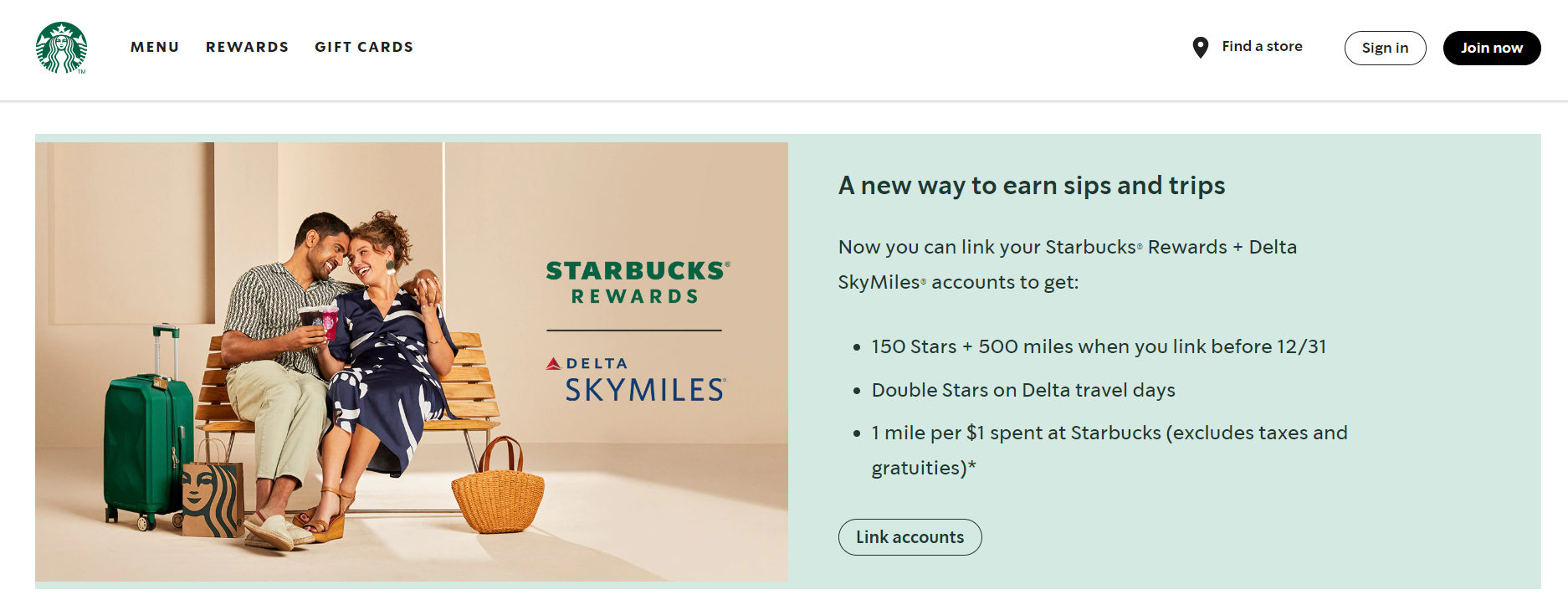
Starbucks uses hues of their brand colour green as secondary and accent colours.
In this example, Starbucks chooses to use different hues of their brand colour green as secondary and accent colours throughout their website. Green typically symbolises nature, calmness and relaxation, while white is often used as a background because it is a neutral colour that pairs well with others and makes text easier to read.
The result is a website that channels calming vibes while still staying true to the Starbucks brand colours and brand identity.
Font and Typography
Font choice is an important consideration and should complement the rest of your visual elements like graphics, images and colour scheme.
Typography is the art of arranging and manipulating the style and appearance of text to make copy clear, legible and visually appealing to the reader.
Since visitors will spend the majority of time on your website reading text, you want to pick a font that is easy to read and is in line with the vibe of your brand. For instance — cursive fonts are often associated with elegance, squiggly fonts are associated with children while thick, bold fonts can also be associated with loud and brash.
Beyond conveying information in a clear and legible manner, text can also affect the user experience. A split-testing study found that different types of fonts and font sizes can improve website engagement by as much as 38%.
To find the right balance for your website text, content writers and designers need to work together to ensure that it is punchy and communicates your message effectively without being too wordy.
Example of Font and Typography in Good Web Design:
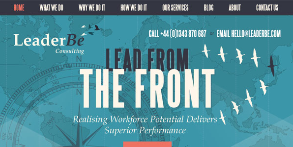
LeaderBe uses different font sizes and positions to make their tagline pop.
In this typography example, “The Front” uses a larger font size and is put on top of “Lead From” — turning what would be an ordinary text tagline “Lead From the Front” into an eye-catching graphic that emphasises what the words mean.
Spacing
During web design, it’s often easy to fall into the trap of filling up every bit of space so things don’t look “boring”. However, too many different elements on a page can have the opposite effect of making a website look horribly cluttered and even outdated. Just think back to websites in the 90s and early 2000s where content was crammed into every space possible.
Today, good modern website designs make great use of negative space to give the visual elements room to breathe. Negative or white space is key to balancing your website’s text, photos and graphics. It gives websites a clean, minimalist look whilst also allowing users to easily navigate the website and view content.
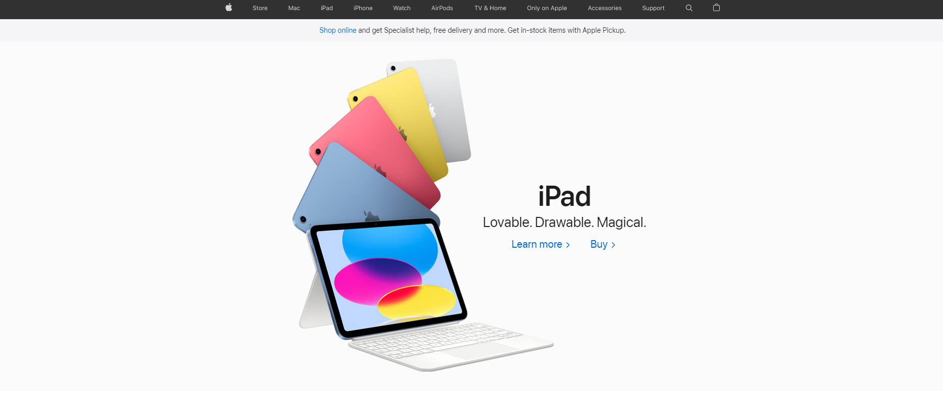
Apple uses plenty of negative space so users focus their attention on the product.
Apple’s website is a classic example of using white/negative space to give the design room to breathe. In this example, Apple uses negative space to draw the user’s eye towards the product. The text is concise, immediately understandable, and users are clearly presented with the option to learn more or buy the product.
Imagery
The adage: “A picture is worth a thousand words” holds true. In web design, images have the power to communicate information in seconds. They can also strengthen your message — if you have a product or service, It’s better to use images to show its unique selling points rather than telling your customers.
It’s best to use original, professional photos for your website. If that’s not possible due to a lack of knowledge or budgetary reasons, you can always source one from stock image websites.
If you’re on a tight budget, look at stock image websites like Unsplash that offer a large collection of royalty-free visuals for free.
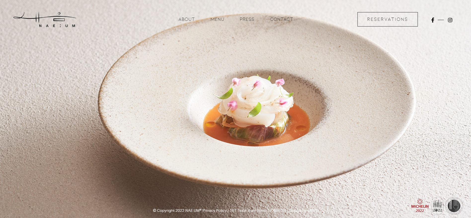
NAE:UM uses a high-quality background photo of a dish to entice users to dine at the restaurant.
Restaurants are a type of business where images on websites matter. Local restaurant NAE:UM’s website is a classic example of a restaurant highlighting its cuisine using vibrant and enticing original images of its dishes. Text is kept to a minimum as the background image takes centre stage, drawing the user’s eye and enticing them to dine at the restaurant.
Functional Elements in Good Web Design
Functional elements in web design refer to the parts of your website which affect the user experience. From loading speed to ease of use, adding to cart and other specific actions — a website that functions smoothly is key to ensuring users stay engaged and even ranking on search engines.
User Experience (UX)
User Experience (UX) is often used interchangeably with User Interface (UI) in web design. However, the key difference between the two lies in their focus. UX is concerned with the big picture and designing optimal solutions that address potential customer pain points throughout their journey. On the other hand, UI is more concerned about visual touchpoints and the aesthetic quality of the product.
In the context of good website design, a UX designer will ask questions like:
- “Is the checkout process smooth?”
- “Does the customer need to login to make a purchase?”
- “Is our feedback form too long?”
Meanwhile, a UI designer will be more concerned with questions like:
- “Will this background colour make the text harder to read?”
- “Does the design of the interface make it easy for users to identify where to click?”
UX is a key element of good web design because it governs how the end-user will interact with your website. When considering your website’s UX, ask yourself how the experience will make the user feel and put yourself in the shoes of a user trying to complete a specific task.
The ultimate goal of UX in good web design is to create an easy, efficient and relevant experience for the end-user.
Navigation
Navigation is how users find webpages they need after arriving at your site. Especially important for websites with multiple pages or items to view, making it easy to find and access information on your site is crucial to a good user experience.
Good web design considers how to organise information and navigation menu styles to help users find what they need in as few clicks as possible. This impacts your website’s traffic, user flow and lead generation. For example, a first-time visitor who is able to find what you have to offer is more likely to become a returning visitor.
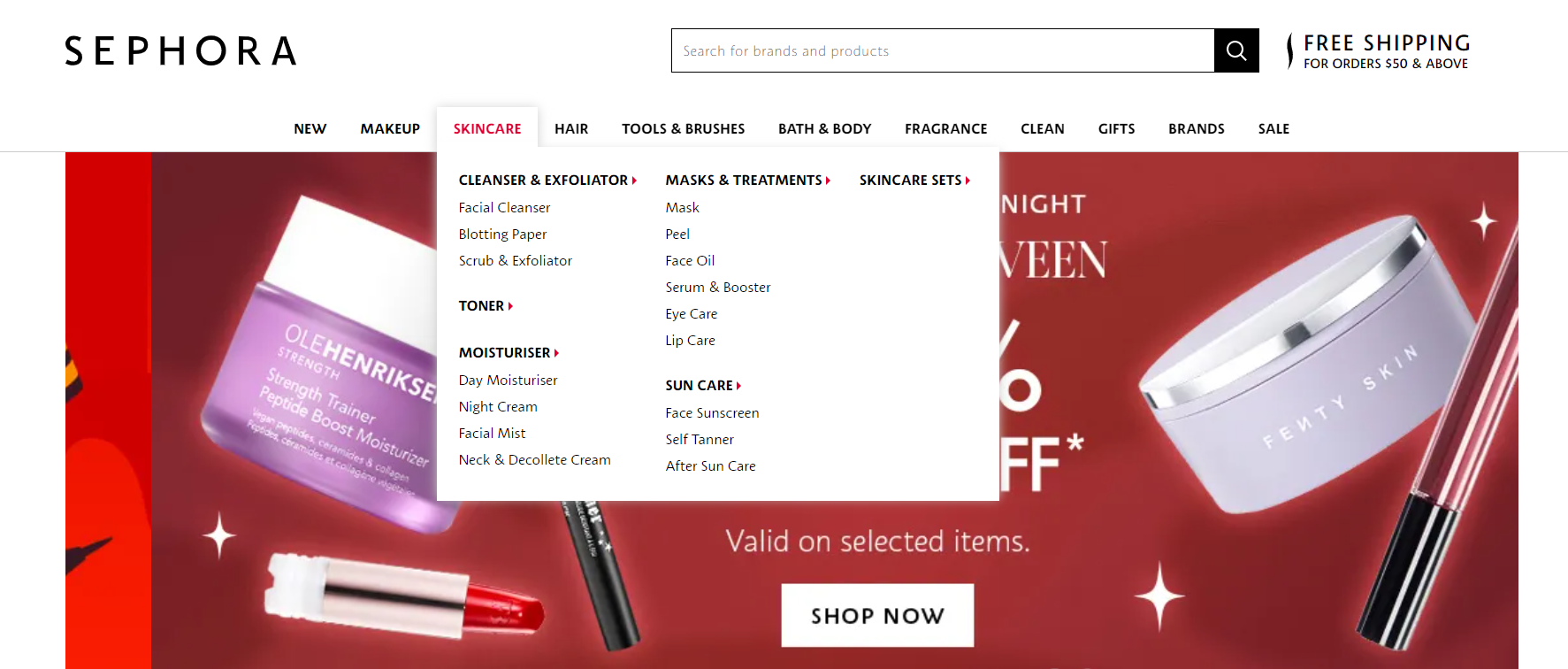
Sephora uses multiple dropdown menus and categories to help users sort through thousands of products.
Sephora is a beauty-retail brand with thousands of products and SKUs. With so many products to consider, its website needs an easy way for customers to filter and find what they need. They use multiple dropdown menus and give customers multiple ways to find what they need by organising their products according to beauty categories, product types and brands.
Speed
Slow loading speeds cause people to become disinterested and leave your website. You don’t want that, which is why it is crucial that your pages load quickly on any device. You can have the best-looking website design in the world, but nobody will bother to take a look if it takes more than 3 seconds to load.
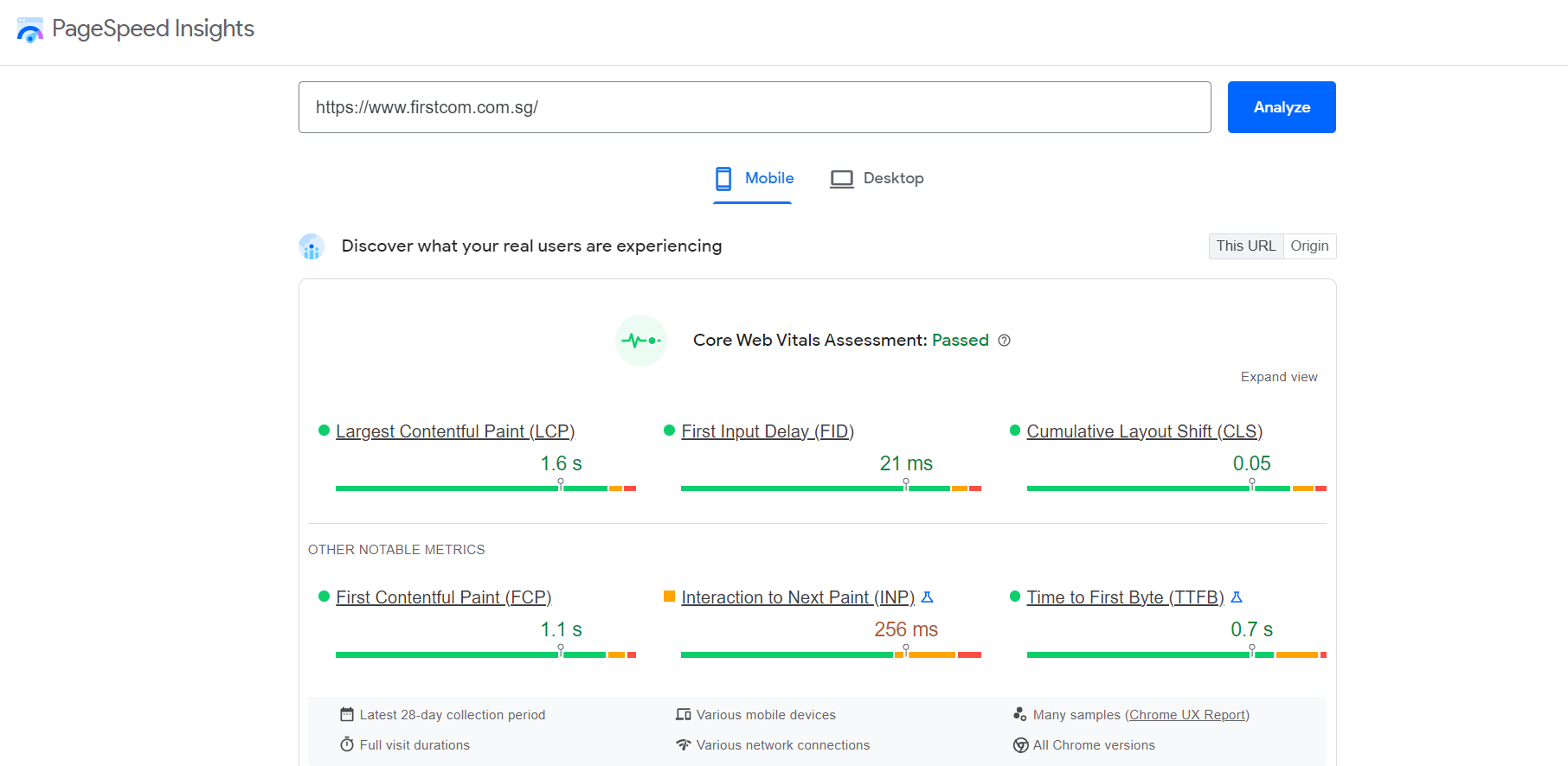
Google PageSpeed Insights tells you how and where to improve your page loading speed.
Furthermore, page speed is one of the metrics Google uses when ranking your website on search engine results pages. Today, you can make use of free tools like Google’s PageSpeed Insights which analyses your website’s loading speed and suggests areas of improvement. There’s no excuse for slow-loading pages!
Mobile-friendliness
With mobile devices accounting for over half of today’s online traffic, it’s more important than ever to ensure your website displays and works well on small screens. It is also common for users to interact with your website on multiple devices — for instance, a customer can browse your website on their phone whilst commuting and make a purchase on their desktop later in the day.
Good web design considers how the website will be viewed on multiple devices, screen size and orientation. This is key to ensuring a consistent browsing experience on any device. Typically, you’ll have to choose between adaptive and responsive design.
Adaptive design typically creates desktop and mobile versions of the same website that adapts based on screen size or browser width.
Responsive design creates websites on a flexible grid that adjusts the site’s appearance dynamically according to the screen size and orientation of the viewing device.
Design Your Website with an Experienced Agency
With over a decade of website design and over 5,500 websites built — FirstCom Solutions ensures your website contains all the visual and functional elements of good web design. We offer complete website design and development services from conceptualisation to post-launch support and maintenance.
See if we’re the right web designer for you! Explore our web development portfolio and see what our clients have to say about working with us.
Like what you see? Contact us for a consultation.