SINGAPORE – Landing pages are a standalone web page typically created for a marketing campaign. They are called landing pages because it is where a visitor “lands” after clicking on an email link or online ad. Good landing pages are designed to get users to complete a singular action, which can be anything from buying a product to filling up a form or simply signing up for a newsletter.
Landing pages can be part of your website but unlike normal pages, they do not feature navigation to any other pages. This is because you want your landing page to be hyper-focused on achieving your goal — which is getting the user to take action.
Because of this you don’t want to create your landing pages blindly! Successful landing pages that convert follow a specific formula and best practices. This article will help guide you through everything you need to know. See our checklist and landing page examples to get started!
|
How To Create A Good Landing Page For Your Website |
Landing Page Essentials
If you are wondering how to create a good landing page, you have come to the right place. It all boils down to ensuring you have the essential landing page components laid out in a cohesive manner.
Unique Selling Point
Before you even draft your landing page, you need to come up with your unique selling point or USP. In the simplest terms, your USP is the “edge” or the perceived benefit of your product or service that makes you a compelling buy and sets you apart from competitors.
Your USP should be clearly communicated throughout your landing page, from the words to the images. This will help drive home what exactly the customers are getting by choosing your business over anyone else.
Start by establishing: what your unique features are that other businesses can’t offer and what value the customers can expect from your offering. Next, deliver this in a short, concise, and memorable way.
For example, Canva’s USP is “Empowering The World To Design.” This reflects their goal to make web design and publishing easy for everyone. Once you have established your USP, you can start building your landing page components.
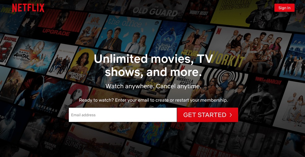
Netflix’s main headline clearly communicates their USP, while their hero shot backs it up.
Main Headline and Hero Shot
Impressions are everything. Studies show that people lose interest after around 8 seconds, so that’s how long you have to make an impact. You don’t want users to have to dig to find out what the point of your landing page is – this is a surefire way to reduce conversions.
Your landing page needs an attention-grabbing headline and a hero shot that complements it.
The headline is critical — it needs to be easy to read and instantly understandable, so it’s best that you break down your offering into the essentials. The best headlines are typically around seven to eight words and can be accompanied by a short description or catchy slogan.
A hero shot on the other hand is a captivating image that depicts your offering. This is the first picture your audience will see alongside the headline. Both these elements combined should be enough for your audience to understand what you are selling.
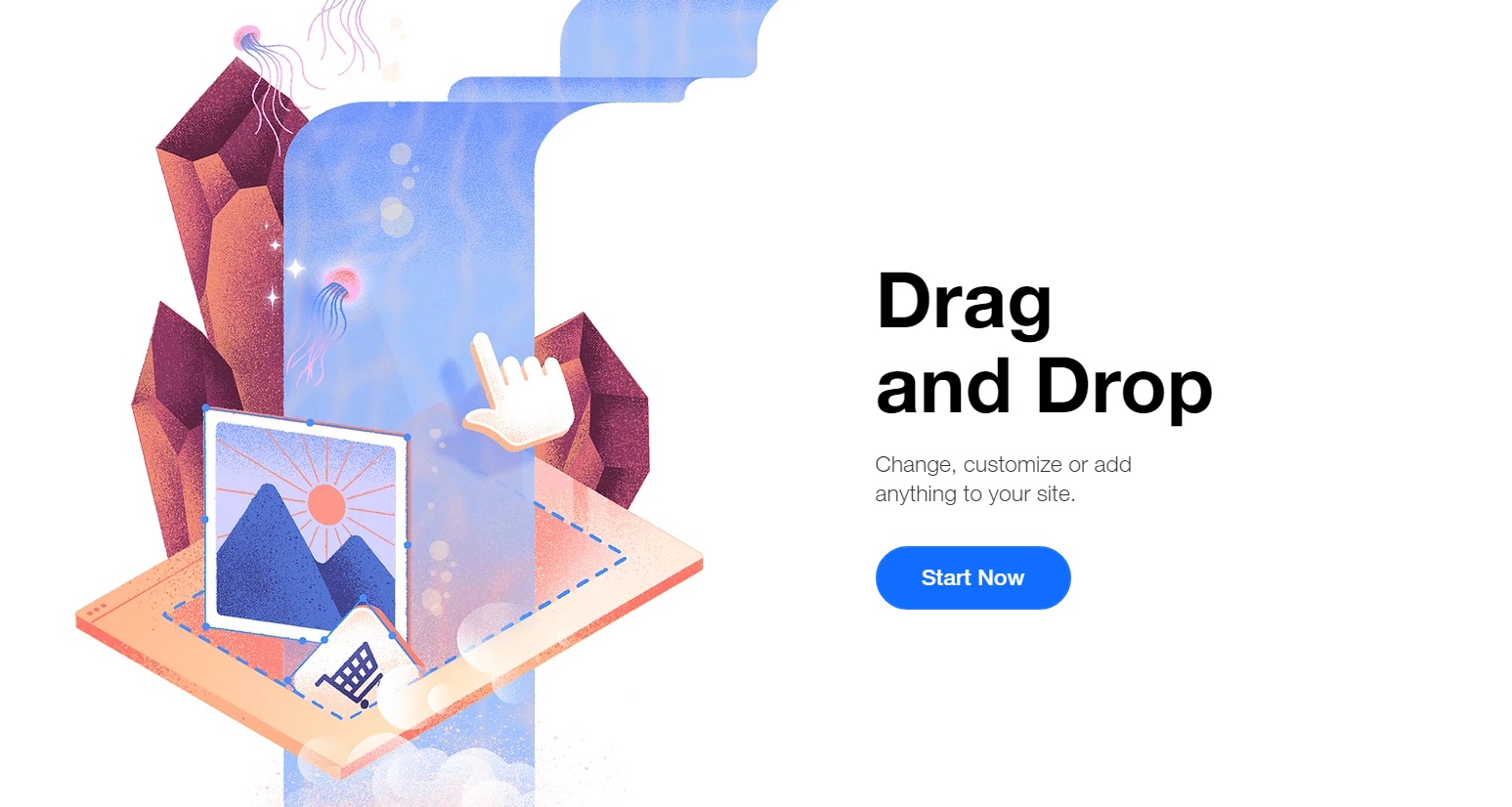
Wix’s landing page is a great example of using short descriptions to add context.
Short Descriptions
Text on landing pages need to be snappy and interesting. You don’t want your audience to lose interest mid-way through the landing page before they get to your call-to-action. Short descriptions are necessary because whilst headers are there to be interesting and pique your reader’s interest, short descriptions help support or expound on your offering. Think of it like the rest of a sentence.
This helps clarify your offering while allowing for additional persuasive information. It’s important to keep your short descriptions to one or two sentences maximum.
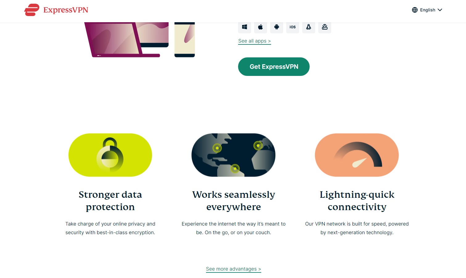
ExpressVPN’s landing page keeps its features and benefits short and sweet with colourful visuals.
Benefits and Features
Once you have established what exactly it is you are selling, you can start to talk more about your offering in greater detail. Your offering can be broken down into benefits and features.
Benefits highlight the value your customers would be getting out of your product or service, while features explain what your product or service can do.
Like all other text on your landing page, you want to make sure to keep these points brief. It’s very easy to go overboard and overload your customer with information — so be careful! Customers are easily put off if they see huge blocks of text.
Keep it simple by sticking to one benefit for each feature. Another common way to make your benefits and features clearer is to have a visual accompanying each point. This can help take the weight off of the writing, making each statement more concise and to the point.
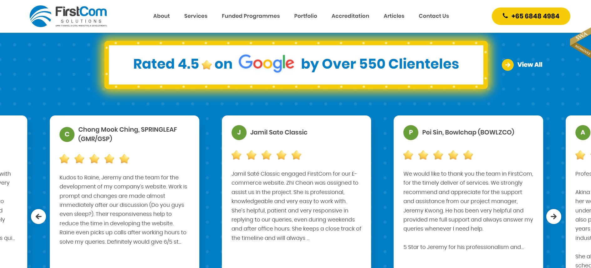
Our web design and development page features Google reviews as social proof.
Social Proof
When we buy products online, we give up the ability to physically test products. Instead, we read reviews and listen to the opinions of others to determine if a product is worth buying or not.
Most successful landing pages include a section for happy customer reviews or statistics that show the number of purchases made. Other forms of social proof include testimonials from experts or well-known individuals, certification from accredited institutions, or awards from relevant organisations.
You can also display public ratings on Google or other public platforms. This can convince viewers that you are not just picking and choosing the most satisfied clients since anyone can post their experiences with your business.
It’s important to add some form of social proof onto your landing page so visitors don’t have to click out of the page to determine if your product or service is worth buying. You don’t want potential prospects clicking out of the page to search for information as they might lose interest or worse, discover competitors.
Your call-to-action should clearly communicate what you want your customer to do.
Call To Action
Last but certainly not least is your call-to-action (CTA). This is the reason why you’ve created a landing page in the first place.
Your CTA should tell customers exactly what you’ve been telling them to do throughout the landing page — whether it’s to shop now, subscribe, or sign up. Whatever you choose, make sure it is a singular action so there is no confusion over what action to take. The CTA text should be direct, informative, and not misleading in any way.
Some examples of great CTA words and phrases to maximise conversions include:
- Get Started
- Sign Up for Free
- Shop Now
- Schedule an Appointment
- Subscribe
Although the natural place for CTAs is at the bottom of the landing page, they can also be used throughout your landing page. You’ll see in the examples we’ve listed in this article that most landing pages have some form of CTA button at each section.
You want to choose a design or colour that stands out and grabs attention whilst still keeping in theme with the rest of your landing page.
Finally, you can also include a short form next to your CTA for customers to submit your inquiry. This gives users a quick and easy way to connect with your business rather than having to click through to a different page.
Putting It All Together
Once you have these essential landing page components mapped out, you can’t go wrong. Here’s a recap of all the essential components you need to craft a great landing page that’ll get you lots of conversions. If you’re ever in doubt, just go through this checklist to get started!
- Unique Selling Point – Establish your advantage over other businesses
- Main Headline and Hero Shot – Introduce your offering and USP
- Short Description – Describe further
- Benefits and Features – Explain key functions and the value of your offering
- Social Proof – Reassure your customers of legitimacy
- Call To Action – Encourage customers to buy, subscribe, or sign up
Conclusion
We hope this article answered all your questions on how to create a good landing page. It may take several tries to get it right, but rest assured that customers will value the time and effort you put into making your website stand out.
A successful landing page should have all the key landing page components with your own unique twist. Check out our checklist and landing page examples to get started!
However, you can also go beyond these points if there are other essentials you want to showcase. Just make sure to spend time fleshing out the foundation of your landing page. Don’t be afraid to invest and inject personality into your site – this may be just what you need to get viewers to keep on reading, which will translate to better sales.